Pyplot Blog1
Purpose of plotting;
Drawing and saving following types of plots using Matplotlib –
1. line plot 2. bar graph 3. histogram
Customizing plots: color, style (dashed, dotted), width; adding label, title, and legend in plots.
Data Visualization
(Graphical/ Visual representation of data / info using charts, graphs, maps etc.)
Data Visualization Through Pyplot
Matplotlib is one of the library packages available in python which is the most common and popular plotting library used to design and display 2D charts (mat – math , plot – graph/chart, lib – library)
Introduced by – Sir J D Hunter
Pyplot is one of the modules/classes of Matplotlib package which supports many types of graphs.
Advantage of Pyplot - the placement of axis and the figure is done automatically with this module as compared to other languages (called –state-machine interface)
Types of Visualization
Rules for Visualization
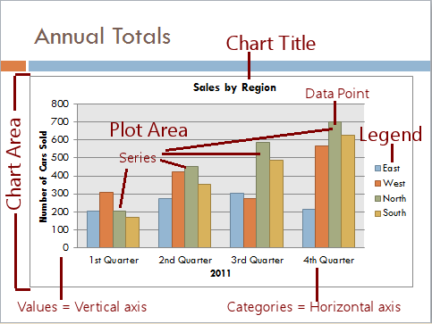
Nomenclature of a Plot
1. Line Plot – shows data series as dots/ data points (called markers) connected to each other which forms a straight line. This plot is used to observe and visualize trend in data over a period of time.
The function or method used is plot( ) which belongs to the module matplotlib.pyplot
This plot( ) will generate a line graph and will show it also .
Syntax –
Part 1 --> import matplotlib.pyplot as mypy
Part 2 --> mypy.plot(data_points, color, marker, linestyle, linewidth, markersize )
Example 1 - Plotting a line plot when no data value is supplied
import matplotlib.pyplot as mypy
mypy.plot( )
** A blank plot area without any markers!!
mypy.show( )
matplotlib.pyplot.show( ) - will show the plot but only if plotted (using plot( ) ).
** No output !!!
Example 2 - Plotting a line plot when asked to plot with random data values
import matplotlib.pyplot as mypy
import numpy as np
random_data = np.arange(0,10,2)
mypy.plot(random_data)
Observations!!!!!
x-axis ???
y-axis ???
Line colour ???
Line style???
Elements ???
Example 3 – Plotting a line in the Line plot with only one given data set/ point
Write the code to show a Line plot for the given Data Point - 12, 4, 15, 10
import matplotlib.pyplot as mypy
mypy.plot( [12, 4, 15, 10])
Observations!!!!!
x-axis ???
y-axis ???
Line colour ???
Line style???
Elements ???
So when only one data set is there = the data set is of 'y'-axis.
Data set of x-axis = system generated (nomenclature).
Range of x will be same as y and will always begin from 0.0.
Q - Write the code to show a Line plot for the given Data Points à
X (Week day no.) = 1 2 3
Y (Visitors during COVID) = 5 7 4
C - import matplotlib.pyplot as mypy
mypy.plot( [ 1, 2, 3 ] , [ 5, 7, 4 ] ) OR X=[1,2,3] Y=[5,7,4] mypy.plot( X , Y )
mypy.show( )
** What are the data labels of the X- axis and Y-axis??? (lower limit and upper limit)
Which type of line ???
Default colour??
Colors
The supported color abbreviations are the single letter codes
'b' | blue |
'g' | green |
'r' | red |
'c' | cyan |
'm' | magenta |
'y' | yellow |
'k' | black |
'w' | white |
and the 'CN' colors that index into the default property cycle.
Line Styles
'-' | solid line style |
'--' | dashed line style |
'-.' | dash-dot line style |
':' | dotted line style |
Markers
'.' | point marker |
',' | pixel marker |
'o' | circle marker |
'v' | triangle_down marker |
'^' | triangle_up marker |
'<' | triangle_left marker |
'>' | triangle_right marker |
'1' | tri_down marker |
'2' | tri_up marker |
'3' | tri_left marker |
'4' | tri_right marker |
'8' | octagon marker |
's' | square marker |
'p' | pentagon marker |
'P' | plus (filled) marker |
'*' | star marker |
'h' | hexagon1 marker |
'H' | hexagon2 marker |
'+' | plus marker |
'x' | x marker |
'X' | x (filled) marker |
'D' | diamond marker |
'd' | thin_diamond marker |
'|' | vline marker |
'_' | hline marker |
You can combine the colour code and the line style / marker
'b'    # blue markers with default shape
'or'   # red circles
'-g'   # green solid line
'--'   # dashed line with default color
'^k:'  # black triangle_up markers connected by a dotted line
In the above codes the plot( ) shows the three coordinates/ marker values (5, 7, 4) of Y axis connected to each other in a straight line.
Customize the plot
import matplotlib.pyplot as mypy
mypy.plot( [ 1, 2, 3 ] , [ 5, 7, 4 ] )
mypy.show( )
mypy.title('Customized Graph')
mypy.xlabel('Week Days')
mypy.ylabel('No of Visitors')
Correct Code -->
mypy.plot( [ 1, 2, 3 ] , [ 5, 7, 4 ], 'r-.' )
mypy.plot( [ 1, 2, 3 ] , [ 5, 7, 4 ], 'g^' )
To add legend - pyplot_object.legend( )
A legend is an area describing the elements of the graph. In the matplotlib library, there’s a function called legend() which is used to Place a legend on the axes.
The attribute Loc in legend() is used to specify the location of the legend.Default value of loc is loc=”best” (upper left). The strings ‘upper left’, ‘upper right’, ‘lower left’, ‘lower right’ place the legend at the corresponding corner of the axes/figure.
mypy.legend(["No of Visitors"], loc='upper left')
The attribute bbox_to_anchor=(x, y) of legend() function is used to specify the coordinates of the legend, and the attribute ncol represents the number of columns that the legend has.It’s default value is 1.
mypy.plot( [ 1, 2, 3 ] , [ 5, 7, 4 ], 'g^', label="No of Visitors")
mypy.legend(bbox_to_anchor =(0.65, 1.3), ncol = 14)
Example 2 - Plotting 2 lines in one plot area. (**in a plot many data sets can be plotted using the plot( ) itself)
Q - Write the code to plot two lines (2 set of data points)
Set 1 Data Points à X = 1 2 3
Y = 5 7 4
Set 2 Data Points à X = 1 2 3
Y = 10 11 14
Code 2 -
import matplotlib.pyplot as mypy
X=[1, 2, 3]
Y=[5, 7, 4]
mypy.plot(X, Y)
X2=[1, 2, 3]
Y2=[10, 11, 14]
mypy.plot(X2,Y2)
#Add customizations to the plot
mypy.title('New Graph')
mypy.xlabel('Age of Children')
mypy.ylabel('Sleeping Hours')
mypy.legend( )
mypy.show( )
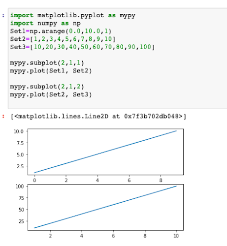
Example 3 - Multiple Views of a Plot which means a plot area will be divided in sub plot areas and as many plot areas, those many lines can be plotted, but the plot area dimension will remain the same.
subplot( ) - is the function which is used to plot many plots on the main plot area where each individual plot will have its own X and Y Axis values.
Although the main Plot area dimension remains the same so if too many subplots are used then the plotting of each subplot will be very small. (Avoid too many subplots).
Requires more than one set of data point)
arange( ) – to give the range of x axis.
import matplotlib.pyplot as mypy
import numpy as np
Set1=np.arange(0.0,10.0,1)
Set2=[1,2,3,4,5,6,7,8,9,10]
Set3=[10,20,30,40,50,60,70,80,90,100]
mypy.subplot(2,1,1)
mypy.plot(Set1, Set2)
mypy.subplot(2,1,2)
mypy.plot(Set2, Set3)
mypy.show( )
** Create a line plot for showing the frequency of temperature in Delhi for the past 5 days in September 2021.
https://www.accuweather.com/en/in/delhi/202396/september-weather/202396?year=2020&view=list
(Customize your plot) Algebraic
Example - To create a line plot with negative axis value
Syntax - matplotlib.pyplot.xlim(negative coordinates range)
Syntax - matplotlib.pyplot.ylim(negative coordinates range)
import matplotlib.pyplot as mypyx=['April','May', 'June', 'July']y=[-20,-10,5,8.5]mypy.ylim(-30,30)mypy.plot(x,y)mypy.show()
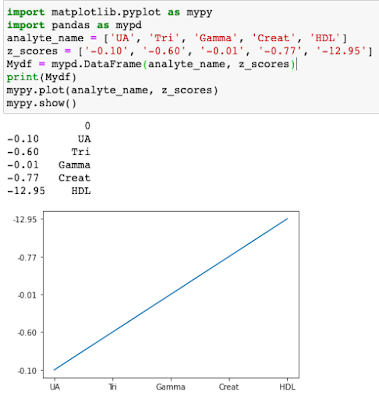
Example - Given a set of data create a dataframe and plot the data in Line Plot.
Data Set 1 - ['UA', 'Tri', 'Gamma', 'Creat', 'HDL']
Data Set 2 - ['-0.10', '-0.60', '-0.01', '-0.77', '-12.95']
or for the findings of the different Blood Values
import matplotlib.pyplot as mypy
import pandas as mypd
analyte_name = ['UA', 'Tri', 'Gamma', 'Creat', 'HDL']
z_scores = ['-0.10', '-0.60', '-0.01', '-0.77', '-12.95']
Mydf = mypd.DataFrame(analyte_name, z_scores)
print(Mydf)
mypy.plot(analyte_name, z_scores)
mypy.show()
Plotting of sine wave values (are curve that represents a smooth periodic oscillations) over a given period of time sing a Line Chart.
https://www.youtube.com/watch?v=-UuhUjZjY9A
** sin( ) function returns the sin0 value for a given data or range of data.
import numpy
print(np.sin(20))
O/P - 0.9129452507276277
Example 2
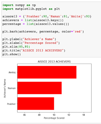
Arguments of bar( ) -
x-axis values
y_axis values
height
width
color
align
Example 1 -
import matplotlib.pyplot as plt
aissce13 = {'Prakher':90, 'Naman':91, 'Amitej':93}
achievers = list(aissce13.keys())
percentage = list(aissce13.values())
plt.bar(achievers, percentage)
plt.xlabel("Achiever's Name")
plt.ylabel("Percentage Scored")
plt.title("AISSCE 2013 ACHIEVERS")
plt.show()
Example 2
Example 3
Example 4
Example 5


Comments
Post a Comment